Designing a Clearer Setup Experience for a Connected Medical Device
Aevice Health · Connected Device Design · 2025
Role
Product Designer (Sole Designer) · UI/UX design and iteration, Usability study protocol, moderation, and synthesis.
Team
1 Project Manager, 3 Engineers
Timeline
Oct 2024 - Feb 2025
Overview
A monitoring device that cannot be setup monitors nothing
One of the most challenging parts of the AeviceMD experience happened before monitoring even began: setup. At Aevice Health, I redesigned the setup flow so a Wi-Fi connection error would not block users from entering the app. I then tested the revised flow with 22 people aged 42 to 82, using their own smartphones and the packaged device. The study validated the new flow and revealed valuable insights which I translated into the next product iteration.
22
2
25 min
Context
Wi-Fi environments vary, and many users failed device setup during a pilot trial.
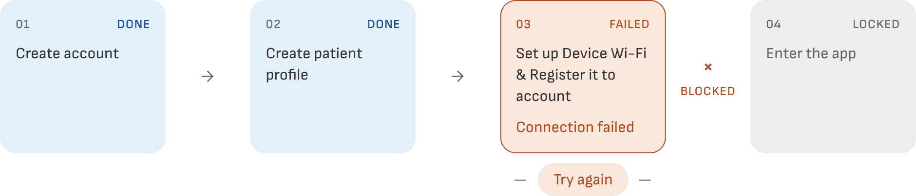
In the old flow users had to set up the device before they can access the app. A failed connection left users stuck in a retry loop, with no way forward and no way out.
Design Approach
Moving Wi-Fi setup out of the critical path
Rather than making device connection a prerequisite, I moved Wi-Fi setup to after the home screen. Users could enter the app first and complete setup when they were ready. If the connection failed, they could return to the app instead of being trapped in a retry loop.

Study Design
Testing the new flow with 22 users aged 42 to 82
To validate the revised flow, I ran moderated usability sessions with 22 participants aged 42 to 82. Most had low to moderate digital confidence and tested the experience across a mix of iOS and Android phones.
Task 1
Onboard and set up the AeviceMD device
Create an account, create a patient profile, connect the device and complete setup.
Task 2
Change the device’s Wi-Fi network
Find the relevant controls in the app and connect the device to a different network.
The study was run in two batches of 11.
Batch 1 attempted both tasks without continuous trainer guidance. Batch 2 completed initial setup with a trainer present, then attempted task 2 without.
Study Insights
The revised flow works and the study revealed what to clarify next
01
Users discovered setup requirements only after something failed
The Wi-Fi network must be 2.4GHz
The Docking Station must be plugged in and powered on
The required Bluetooth and location permissions must be enabled
9 of 22 expected mobile data or a 5GHz network to work, and others began setup with the Docking Station unpowered. None of it was stated anywhere in the flow.
“
It was unclear whether Wi-Fi or mobile data was required for setup until the ‘Wi-Fi not enabled’ dialogue appeared.
— Participant #B107, 67 years old
“
I thought the device came fully [charged] and is battery powered.
— Participant #B203, 74 years old
02
A critical physical step was easy to miss
16 of 22 did not know the Sensor had to go back on the Docking Station for task 2. Some were also unsure which physical objects the terms “Sensor” and “Docking Station” referred to.
“
Should I take out the Sensor and put it back?
— Participant #B109, 74 years old
Design Deep Dive
Making technical setup easier for users to navigate

Tell users what won’t work, and catch it early
Replacing static frames with animation for key actions
The first setup screen step animates how to plug in the Docking Station. Users can match the action on screen to the device in their hands.
Gate progress on the steps that break setup
Before pairing, the flow asks users to confirm the Sensor is seated on the charging pins, and states which permissions are needed and what each one does.
Reflection
Bridging the gap between physical and digital user experience

Technical constraints are mine to translate
What I’d do differently
I would test the device, app, quick-start guide, network and phone settings together much earlier. Users experience them as one setup journey, and any handoff between them can determine whether the entire flow works or fails.